Wednesday, May 7, 2014

Bulbs

Original
Focal Length34mm
Exposure1/60
F Numberf/4.5
ISO320
Revised
The first image had a cyan cast to the whites so I had to go into Hue/Saturation in the adjustments panel and I adjusted the cyans taking down the saturation. I also tried to add more yellow into the bulbs by using the quick selection tool and selecting the bulbs again going into Hue/Saturation. Overall I think the image is more bland and has less contrast, but that can be easily adjusted. 


Tuesday, May 6, 2014

Not so much of a photo process

Focal Length34mm
Exposure1/60
F Numberf/4.5
ISO100
I like this photo because of the purples in it it reminds me of something a lomography camera would produce, plus I just really love these flowers, they smell so sweet and bring back a nostalgic feeling of summer for me. I don't really remember what I did in photohop, I'm thinking maybe I just changed the hue or something, but I just felt like sharing this :)

Photo Process: Sink

Focal Length48mm
Exposure1/100
F Numberf/6.3
ISO6400
So to make this photo, I just added water to an old tube of mascara and just splattered the watered down mascara on the white sink. When editing it in photoshop I went under adjustment layers and clicked the white dropper on the left side. Then I clicked on the white areas to brighten them up with the white dropper. After I added a grunge overlay and resized it.

Tuesday, April 8, 2014

Rineke Dijkstra


link
 link
These photos were taken by Rineke Dijkstra if you didn't see the title, but I really like her soldier photos especially the first one because of the transformation process in the person's eyes. The first frame he looks so pure and young then as time progresses to the last slide his eyes are hard and have no emotion. You can really just imagine what this man has been through and what he has seen, or maybe you can't. I just really like how it tells a story. On the sixth frame is where I see the transformation so you just have to think what happened between the slide before it. I also enjoy the second photo because the background is so beautiful and pure, not yet touched by men. The landscape is free of houses or roads or any civilization, but there's this man smack dab in the middle who could bring the destruction of the whole peaceful area. I think that the transition of the people is something that I would like to try for myself but of course, it takes time.

Monday, March 31, 2014

What is Concepting With Craig Smallish

On lynda.com while watching the video, Craig Smallish talks about how to develop a project and come up with an original idea.

The Concept Building Processes are: Core Values, Free Association, Descriptives, Rough Sketches & Investigate Variation. Smallish also says that creating many ideas can help

Figuring out who your client is also makes you more likely to gain their trust. Smallish suggests giving a client brief to get the basic information about your client. Make sure to meet the client in person and even better at their own home, which can reflect their own personality.Basically anything where you can see body language Sketching notes can be helpful. Though provoking questions are key.Maybe ask them what their greatest achievement is or lessons they've learned and the best decisions they'v made. Remember this information should be the foundation but not the whole of your project.

Once you understand the basics of your client, ask yourself what solution you are attempting to provide to them. Smallish also suggests project briefs where you can really get a feel of what you're doing and meet in person like the client brief. Again notes & sketches will help.

Monday, March 24, 2014

Chalkboard Paint

I also like this idea, painting the lids with chalkboard paint and giving them labels, I have a friend who recently painted her room with chalkboard paint so maybe she would have some extra paint. 

Supersauce

Many people in the class are using super sauce, which is a liquid slime that transfers images on metal, wood and glass. Jordan and Lacey have transferred images on aged pieces of metal. Jordan's image on the metal was more effortless because she slowly pulled of the paper from the corner, Lacey's image teared a few times and where she had touched the paper there was a finger print, which I think is kind of cool. Stephanie also tried this process on wood and it worked out terrific. I also think that Brittany's idea was cool because she put an image on glass and it looked cool on both sides of the image.

Anthotypes in General

Two girls in my glass attempted to do anthotypes but both of the process just left behind a blank piece of paper unfortunately. Stephanie's process was supposed to stay in direct sunlight less than Taylor's (which I already mentioned) because she didn't use cabbage but it still didn't turn out the way it should have.

American Horror Story Jars


http://static2.wikia.nocookie.net/__cb20121114182653/americanhorrorstory/images/f/f0/Opening_Credits_for_Season_1


Maybe you watched season 1 of American Horror Story and liked the eerie jars as much as I did which are shown above, which inspired me to put images on mason jars or any old jar that's around.

Vintage Pictures in Mason Jars So here's the final result that I found here. They put olive oil in the mason jar and I really like the look that it gives off. If I did this I would put olive oil in it and I also saw another site put old rose petals in the olive oil. I wouldn't be able to just put the image on the glass because as you can see on that picture, mason jars have letters and numbers on them that protrude from the glass. So making a sticker like Rosy's process wouldn't work for mason jars, but If I wanted to do  that then I would have to use any other jar, which I do have. So I'm pretty sure that this will be my final project.

Wednesday, March 19, 2014

Styles and Themes

I'm really interested in creepy photos that look old and spooky. I think one of the best inspirations for this theme would be the book "Miss Peregrine's Home for Peculiar Children." The images are actual images that the author, Ransom Riggs, found and tied in with the story. All of the images are older and peculiar in some way. Here are a few from the back of the book.


 http://www.ransomriggs.com/storage/back.jpg?__SQUARESPACE_CACHEVERSION=1294441733489

Helpful Youtube Tutorials

I found a tutorial on youtube that can tell me how to get those images that have that nostalgic look to them, and almost look like an instagram picture. I really like this look, I'll probably link the video later because youtube is blocked here. I'm really glad that it shows me on photoshop too and I don't have to get any obscure program. It's actually quite simple too, with just a few steps. I found the link. Click here

Friday, March 7, 2014

Quilt Project

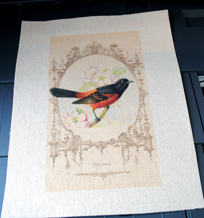
So we need to find alternative ways to print an image on fabric because we're making a class quilt, which personally, I think is really cute. Since the process I did used gel medium it wouldn't be a good candidate. (It makes the fabric a bit stiff.) Side note I put it in the washer and some of the image came off. Anyways, yesterday I borrowed a fabric transfer kit and I'm wondering how that would turn out. I also searched for a way to print images on fabric and I found a process that used a plain ol' inkjet printer, the only draw back is  that it has to be 8 1/2" x 11" which is probably going to be too big for an individual quilty section. Here's the link if you want to check it out. So that's what it looks like, actually I take it back. It could work but you would be wasting fabric, unless you printed like 4 at a time. Yeah that would probs work.

Tutorial for Printing on Fabric
http://thegraphicsfairy.com/wp-content/uploads/2013/09/How-to-Print-on-Fabric-GraphicsFairy71.jpg

Thursday, March 6, 2014

!


Look a this photo! It's of an opossum. I think it's great, just wanted to share this. I really like peculiar old photos.

http://www.nicephotomag.com/wp-content/uploads/2009/08/A-possum-and-a-movie-camera-1943.jpg

Taylor's Alternative Process

Taylor did Anthotypes for her alternative process and she used cabbages. You can use any vegetable as long as it is fermented. I don't really have a good sense of smell but apparently it smells horrible. I wouldn't use cabbages, but it did come out as a pretty purple color. The process seemed pretty simple and she taped it onto the window, because that's what you do.The directions are here if you want to try it out (Taylor used a canvas)

Tuesday, March 4, 2014

Alix's Alternative Process

Alix did cyanotype and her directions are here. The outcome in the class I believe didn't even come out because you need to use hot water and there might not have been enough light. You also have to mix chemicals and if you mix them, together they only last for about a few hours and try to avoid light, but she also said a tiny bit of light is okay. The longer that you keep the image under the glass also will result in a lighter hue of blue.

My Alternative Process

So as I said in an earlier blog post, I was going to transfer images to a T-shirt. If you want the directions they are here. So I realized that you need a lot of gel medium. Like a lot. So Mrs. Underwood suggested adding about 2-3 layers of gel medium, just like adding coats of paint to a wall. You apply it, let it dry then apply gel medium again. Make sure you get the edges and don't put any gel medium on the opposite side of the image. Also instead of just spraying water, soak the whole T-shirt in water, this helps peel off the paper. I think that avoiding very glossy paper might give you better results and I've found that newspaper seemed to work the best. I also used some very old newspaper about 50+ years old and I wouldn't suggest that because the paper is very hard to take off. Next I'm going to see how well it works in the dryer, hope this helps.

Rosie's Alternative Process

What Rosie tried to do was print a black and white image on glass, but unfortunately it didn't turn out the way she wanted. To do this you need contact paper and you stick the contact paper onto the image. Next you soak it, both the contact paper and the image when they are stuck together. So then you rub off the paper then let it dry. Once dry it should be sticky again, then you stick it on the glass. So you've basically made a sticker. What Rosie did next kind of was when the project went downhill. She smashed it with about 3x, which you should probably only do once. Then Mrs. Underwood put on some India Ink, but it turned out that she applied too much India Ink and most of the image was turned black. So that was the main problem.

Tessa's Alternative Process

Tessa used a similar process to mine except she used mod podge instead of polymer which I'm using for mine. She transferred the image on a small canvas. First she took newpaper and coated it with mod podge on the canvas, along with adding some stamps from her stamp collection. When the mod podge dried clearly, she had another image of an old world map and applied mod podge to the side of the image with laser ink on it. She stuck it face down in the center and again, when it dried she took the paper off by spraying it with water and using circular finger motions to rub the paper off. DON'T PEEL, that could pull the ink off. I'll add a link to Tessa's blog HERE. She also added the process on her blog so you can check that out, because you can literally do this on anything. Conclusion: Mod Podge is awesome.

Friday, February 14, 2014

VSCO cam & A beautiful mess

So I think that I'm going to use VSCO cam to edit my photos, not sure if I mentioned that already. I've been really frazzled lately. Anyways I found a blog called abeautifulmess.com while I was just searching pinterest for alternative processes. This gave an alternative way to put images on fabric from my first post. From what I believe it said that you need laser something, which is basically images from a magazine or from those big ugly printers like this:


So you could just go to a Walmart or a store like that and print out your images there, but then what you do is you put gel medium on the side of the image. Not the back of the image, really the side where it's all picturey. Then you place it one a piece of fabric and leave it overnight. When you wake up it should be all dry, so then what you do is get a spray bottle and wet the picture so that you will be able to rub off the paper and the ink should stay on the image. I haven't tried it out for myself but it seems better than the other option. So here's the blog where I got this idea from :)

Le Click here

Wednesday, February 12, 2014

Second Guessing / Gigantic photo rant / Photo Crisis

I think I'm starting to second guess printing my photos on T shirts because other people in the class are going on to print photos on really alternative things, like printing a photo on a T shirt to me now seems to be more like an arts and crafts like project. I also am second doubting my portfolio, my dog. I feel that it is more towards the fine arts part of photography and I don't want to go towards that path. I really like the one below:

http://24.media.tumblr.com/446c9deb9fb86560d70eae7a25675392/tumblr_mrelm6OHlw1rh9y8wo1_1280.jpg

But I'm worried that if I decide to go down this path with the low contrast and vintage-y vibes that there will be lapses in quality. Personally, I think I would more enjoy photography like the one above because when I do fine arts, I feel that I'm not doing what I what, I'm just doing what others expect. For me, this is a real change and I think it will help me not only develop as an artist, but as a person by doing what I feel is right in my heart. I'm also very interested in nature photography but I understand to have your nature photos stand out you must somehow portray emotions, which I find to be very difficult. I really enjoy taking photos on my phone as opposed to using a DSLR also which might pose a problem quality wise, but people have won gold keys only using their phones. Right now I am definitely in a photo crisis. 
http://25.media.tumblr.com/66b4bb9acb4b90ecd3cc841580952ccf/tumblr_mx3qerJET31rbcubso1_1280.jpg

This kind of ties in so I figure I'll add this into this post also. Last night I was watching the Sochi Olympics, and I'm not the kind of person that votes for the US just because I live here. Germany, Sweden and Russia are the countries that I will always root for, and last night at the Men's Snowboarding Halfpipe thingy the snow was melting, tensions were rising and the point where American, Shaun White possibly might not come home with any medals was a logical thought. But it was amazing because Iouri (pronounced Yuri) Podladchikov, a boy born in Russia, and competing for Switzerland won the gold over Shaun White, whom had made some drastic slip ups (literally, his board didn't land correctly and he fell a few times, shocking.) costing him the medals, but that's beside the point. This young Swiss man, Iouri is also a photographer while his parents are both Mathematicians and believe that "Sports are for dumb people," or something along those lines. His parents dont' believe in his art or his sports and I think that's amazing that he just does what he wants and (super cheesy moment) he follows his heart. (Japan also won silver and bronze for the first time in this event.Two for you, you go Japan.) This was a really strung out and kind of relevant story but I really need to express myself the way that I want. I feel like I just assessed my whole life problems in one blog post. If there was an award for blogging about your Advanced photo problems, then I would win gold for sure. Iouri also has a tumblr blog where you can check out all of his photos if you're interested. Just click HERE

Thursday, February 6, 2014

Alternative Process - Printing Photos onto fabric

I recently saw a video on transferring a photo onto a T-Shirt and I thought this would be a really cool idea to tie in with the alternative process assignment. So if you would also like to do this, you'll need a T-Shirt, a printer, fabric transfer paper (that can be purchased at craft stores or a best buy/walmart) and the image that you would like to put on a t shirt. I suggest adjusting it on photoshop and making sure it's the size you want. You can test it out on normal paper so you don't waste your fabric paper. Also it's quite helpful if you adjust the corners so they are rounded so if it does wear it will not affect the image as much. So now that you have all of your needed supplies, follow the directions CAREFULLY on the back of the fabric paper. Make sure when you transfer the image onto the shirt that you're in a clean area on a table. Then once you feel that you've followed the steps, take the backing to the paper off then use an iron, make sure there is no steam, as this will be too hot and ruin the image. Iron on a flat hard surface, not on and ironing board. Once you've gone over every area of the image you have your finished project. I would recommend that you wait 24 hours before washing or wearing the shirt. Anyways happy printing, and good luck. I hope this was somewhat helpful.

Thursday, January 9, 2014

Late Chritsmas

    Merry late Christmas! In honor of late Christmas I present to you this image! This year we got white lights for the tree and I'm so thankful for it. I think it really complements this image. So what I did was I set the ISO at 200, F stop at 2.8, exposure at 1/15, and the focal length of 22mm. I also had to sharpen the image a bit and then I selected the eye with the magnet tool and brightened the eye, then added more saturation. I think that was pretty much it. The only thing I wish I could change about this image is the arm of the couch being there but besides that I like this image.

Wednesday, January 8, 2014

Claws

I like this photo because of the eerie aura around it. To me it reminds me of a perching crow about to attack, but it's not, its just my harmless dog. I don't have any information for ISO, F stop etc. I also really like how the background in the trees is a bit blurry. It's just a really creepy photo and that's what I was going for. I also like how one of the paws is unfocused yet the other one in the distance is. The rock also looks very sharp and eroded which I like.

Howling Dog

I took this image with a 20mm lens 1/500 exposure 2.8 for the f stop and an ISO of 200. Personally I think it looks a bit grainy but I think that the angle gives a good perspective. My dog, Autumn, at the time was barking because she wanted a treat. You can see the drool on the side of her mouth is you look closely. I wish that the dog was not so close to the middle of the camera but overall I think the image turned out okay. I think that if I had to make changes I would have made it more clear and played around with the settings. If I took a few more snaps of this it would have came out better but since the action happened so quickly it would have been tough but it would have payed off. As I mentioned early I wish I could have moved her over to the side more.