Monday, September 30, 2013
Silver
This photo is my favorite, but unfortunately has lots of noise when it's larger which is why I've made it smaller than the others. I like it so much because it looks like it has water droplets on the handle. It looks very sleek also because it's surrounded by black
Tools
Personally I don't think this photo is very strong and is actually the weakest because you can see on the wrench that it is over-exposed to the point where you can't see any details.
This photo also doesn't have any details because I took it from my flashdrive and then uploaded it to pixlr. The rest of my images don't have details. Could that be why?
This photo also doesn't have any details because I took it from my flashdrive and then uploaded it to pixlr. The rest of my images don't have details. Could that be why?
Redneck's Love

The contrast is what catches my eye in this photo. I hadn't realized when I was taking this, but there is only one bottle that is completely white, the one on the side, which I was trying to make the main subject.
Photo Deets: not sure why, but google+ has no details on this photo
| Camera | - |
| Focal Length | - |
| Exposure | - |
| F Number | - |
| ISO | - |
Wayward Wrungs
"Rungs" was actually a tricky photo to take. This ladder took me a while to capture this well because I had to kneel down on a hill while tilting the camera to an odd angle. Without the angle the photo looked very drab when I captured it straight forward. I'm pretty happy with the way this photo turned out.
Photo Details:
Photo Details:
| Focal Length | 37mm |
| Exposure | 1/160 |
| F Number | f/10 |
| ISO | 1600 |
Tatters
Most of my photo's in the geometric series were taken on my Dad's dump truck and I found this on the side. It's basically a tarp rolled up. The concentric circles are what drew my attention to it. I also like the contrast between the tattered and worn tarp compared to the rough metal beside it.
Photo Details:
Photo Details:
| Focal Length | 37mm |
| Exposure | 1/160 |
| F Number | f/9 |
| ISO | 1600 |
Metal on Metal
I like this photo because of the gritty features in the metal. My favorite details are how all the metal pieces are lined up by height.
Photo Details
Photo Details
| Focal Length | 40mm |
| Exposure | 1/250 |
| F Number | f/4.5 |
| ISO | 1600 |
Cadena
"Cadena" is a pretty simple photography, the reason I view this photo as one of my 10 best is because of how the chain breaks the solid grey in the background.
Photo Details:
Photo Details:
| Focal Length | 28mm |
| Exposure | 1/160 |
| F Number | f/7.1 |
| ISO | 1600 |
Go Straight
This photo "Going Straight" was created by adding to lines in a small pile of sand found in the back of my father's dump truck. What I tried to represent in this photo was normality and people following others. To me straight paths are boring and people who follow these "straight paths" are like blinded sheep, following each other down a blind road.
Photo Details:
Photo Details:
| Focal Length | 28mm |
| Exposure | 1/400 |
| F Number | f/10 |
| ISO | 1600 |
Thursday, September 26, 2013
Preface: White on White, Minimalism
Personally for me, minimal photos seem like they would be a challenge because of all the white. Just the settings would be a challenge. I do like the idea of white on white, It's something that I can appreciate. It's so futuristic. Here are some of my favorite white on whites:

credit I like how calmed the lion is in this photo. It doesn't even look real.

credit This photo is amazing because you can't really tell where it ends or begins, it just blends into the background of the post

credit I like how calmed the lion is in this photo. It doesn't even look real.

credit This photo is amazing because you can't really tell where it ends or begins, it just blends into the background of the post
Tuesday, September 24, 2013
10 best photos information
Dog Yawning:
| Focal Length | 53mm |
| Exposure | 1/250 |
| F Number | f/10 |
| ISO | 6400 |
Mother in The Light:
| Focal Length | 18mm |
| Exposure | 1/60 |
| F Number | f/4 |
| ISO | 800 |
Lonely Ballerina:
| Focal Length | 18mm |
| Exposure | 1/640 |
| F Number | f/14 |
| ISO | 1600 |
Someone's Home:
| ocal Length | 4.28mm |
| Exposure | 1/120 |
| F Number | f/2.4 |
| ISO | 80 |
Rosy:
| Exposure | -CREATED IN PHOTOSHOP |
| F Number | - |
| ISO | - |
| Camera make | - |
Mushroom:
| Focal Length | 4.28mm |
| Exposure | 1/60 |
| F Number | f/2.4 |
| ISO | 50 |
Bike Hand:
| Focal Length | 25mm |
| Exposure | 1/200 |
| F Number | f/5.6 |
| ISO | 800 |
Handet:
| Focal Length | -unknown? |
| Exposure | - |
| F Number | - |
| ISO | - |
(Unusual Flowers and Framed Chair also don't have any information)
Inspiration - Geometric / Repetition

Arches really draw my attention when looking at repetitive photography. The beauty of the un-moving wood in such an elegant curve. I love the way the shadows are cast and everything looks perfect in this photo. link
Tuesday, September 17, 2013
"Alfred Stieglitz was responsible for elevating photography from a craft to an Art Form."
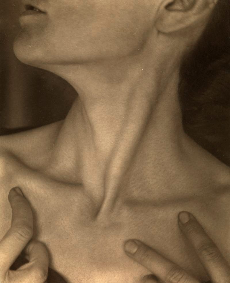
I believe this statement to be true, especially because of Stieglitz's portrait work of his wife, Georgia O'Keeffe. He showed beautiful angles of O'Keeffe's body. My favorite photo of Georgia O'Keeffe is an up close photo of her neck. It looks so beautiful, her collar bones and the strain in her neck. The collar bones cast a haunting shadow and it makes the photo look soft, elegant and delicate. I think this is an influential photo, and does look like art, rather than just point and shot. This image, being a piece of art, paves the way for photographers and their many critics who claim that photography is not an art.

Not only did Stieglitz use angles to convey his photography, but he also used the harsh reality of going into coal mines and photographing the young child laborers, this gives photography an edge because this would be something that any other art form could not do. Sure, they can go ahead and paint a picture of a coal mine, but they wouldn't exactly be able to capture the raw emotion of the young children while working. I also like Stieglitz's photo of a blind woman, because similar to the coal mines it conveys raw human emotion. This intense photo shows a blind woman with a gouged eye. The harsh reality that people in the world are suffering not only brings an gritty art form, but also captures the world as is.

http://artblart.files.wordpress.com/2011/04/14_strand_blind_1916_72dpi.jpg
During Stieglitz's time, photography was not considered an art by most. The quest to prove these critical artists began with pictorialism. The photos were made to look similar to paintings, with soft light and out of focus images. The final product would be a mysterious but stunning twist on photography. The image below is stunning because of the light on the woman's face. The image is blurred and makes the photo look similar to a painting. Even though some artist today still look down on photography, Stieglitz paved the way to make it gain some degree of respect and appreciation.

http://venetianred.files.wordpress.com/2008/11/steichen-portrait-1903.jpg
I believe this statement to be true, especially because of Stieglitz's portrait work of his wife, Georgia O'Keeffe. He showed beautiful angles of O'Keeffe's body. My favorite photo of Georgia O'Keeffe is an up close photo of her neck. It looks so beautiful, her collar bones and the strain in her neck. The collar bones cast a haunting shadow and it makes the photo look soft, elegant and delicate. I think this is an influential photo, and does look like art, rather than just point and shot. This image, being a piece of art, paves the way for photographers and their many critics who claim that photography is not an art.

Not only did Stieglitz use angles to convey his photography, but he also used the harsh reality of going into coal mines and photographing the young child laborers, this gives photography an edge because this would be something that any other art form could not do. Sure, they can go ahead and paint a picture of a coal mine, but they wouldn't exactly be able to capture the raw emotion of the young children while working. I also like Stieglitz's photo of a blind woman, because similar to the coal mines it conveys raw human emotion. This intense photo shows a blind woman with a gouged eye. The harsh reality that people in the world are suffering not only brings an gritty art form, but also captures the world as is.

http://artblart.files.wordpress.com/2011/04/14_strand_blind_1916_72dpi.jpg
During Stieglitz's time, photography was not considered an art by most. The quest to prove these critical artists began with pictorialism. The photos were made to look similar to paintings, with soft light and out of focus images. The final product would be a mysterious but stunning twist on photography. The image below is stunning because of the light on the woman's face. The image is blurred and makes the photo look similar to a painting. Even though some artist today still look down on photography, Stieglitz paved the way to make it gain some degree of respect and appreciation.

http://venetianred.files.wordpress.com/2008/11/steichen-portrait-1903.jpg
Monday, September 9, 2013
Subscribe to:
Comments (Atom)


